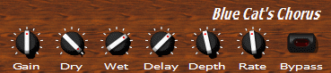
Let's look at the following simple skin for Blue Cat's Chorus (freeware plug-in that can be downloaded on http://www.bluecataudio.com)
It is composed of the following files:
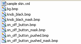
'sample skin.xml' is the skin file. It contains all information about the layout of widgets and the eventual parameters of the plug-in they are linked to. Its content is detailed later.
'.bmp' files are the graphical resources used by the skin:
 |
bg.bmp: the background image. As you can see, it is smaller than the total surface of the skin. It is repeated in order to cover the whole skin surface. |
 (extract)
|
knob_black.bmp: 'film strip' containing 127 images for the knob. Just like a movie, it is an animation: the image displayed depends on the parameter value. |
 (extract)
|
knob_black_mask.bmp: this is the alpha mask file for the film strip. This is the file which contains transparency information for the knob_black image. Black pixel means 100% transparent and white pixel means opaque. Intermediate gray pixels mean transparent. The darker, the more transparent. |
 |
on_off_button.bmp: 'film strip' containing the two images for the button: 'off' state and 'on state' |
 |
on_off_button_mask.bmp: alpha mask file for the button film strip. |
 |
on_off_button_pushed.bmp: 'film strip' containing the two images for the button when it is pushed: 'off' state and 'on state'. |
 |
on_off_button_pushed_mask.bmp: alpha mask file for the button pushed film strip. |
The content of 'sample skin.xml' is printed below. Comments are prefixed with "<--", they explain you the main structure of the skin file. The details of the XML syntax is explained in about XML section, and the keywords and skinning language are detailed in the tutorial and reference sections.
<?xml version="1.0" encoding="utf-8" ?>
<!-- Skin Node: the root node of the skin. Here it defines a default font.
widgets inside it will be displayed in a column.-->
<SKIN author="Blue Cat Audio" name="Sample 1 for Blue Cat's Chorus" language_version="1.0"
   font_face="Tahoma" font_height="11" text_color="#ffffff" font_quality="cleartype" layout_type="column"
   background_image="bg.bmp" repeat="true" v_margin="5" h_margin="10" spacing="3">
   <!-- Title -->
   <TEXT h_align="right" value="Blue Cat's Chorus " font_height="20" font_weight="bold" font_style="italic" />
   <!-- Row of controls with param names on top of them -->
   <ROW spacing="10">
      <!-- Param 1: a column containing a knob and the name of the param-->
      <COLUMN v_align="top">
         <IMAGE_PARAM_KNOB param_id="dsp.input1" image="knob_black.bmp" image_orientation="horizontal" cursor="system::hand"
            images_count="127">
            <!-- The tooltip is declared under the Knob so that it is displayed when the mouse is over the knob.-->
            <PARAM_TOOLTIP show_on_click="true" param_id="dsp.input1" delay_ms="0" />
         </IMAGE_PARAM_KNOB>
         <PARAM_TEXT param_id="dsp.input1" content="{name}" />
      </COLUMN>
      <!-- Param 2-->
      <COLUMN v_align="top">
         <IMAGE_PARAM_KNOB param_id="dsp.input2" image="knob_black.bmp" image_orientation="horizontal" cursor="system::hand"
            images_count="127">
            <PARAM_TOOLTIP show_on_click="true" param_id="dsp.input2" delay_ms="0" />
         </IMAGE_PARAM_KNOB>
         <PARAM_TEXT param_id="dsp.input2" content="{name}" />
      </COLUMN>
      <!-- Param 3-->
      <COLUMN v_align="top">
         <IMAGE_PARAM_KNOB param_id="dsp.input3" image="knob_black.bmp" image_orientation="horizontal" cursor="system::hand"
            images_count="127">
            <PARAM_TOOLTIP show_on_click="true" param_id="dsp.input3" delay_ms="0" />
         </IMAGE_PARAM_KNOB>
         <PARAM_TEXT param_id="dsp.input3" content="{name}" />
      </COLUMN>
      <!-- Param 4-->
      <COLUMN v_align="top">
         <IMAGE_PARAM_KNOB param_id="dsp.input4" image="knob_black.bmp" image_orientation="horizontal" cursor="system::hand"
            images_count="127">
            <PARAM_TOOLTIP show_on_click="true" param_id="dsp.input4" delay_ms="0" />
         </IMAGE_PARAM_KNOB>
         <PARAM_TEXT param_id="dsp.input4" content="{name}" />
      </COLUMN>
      <!-- Param 5-->
      <COLUMN v_align="top">
         <IMAGE_PARAM_KNOB param_id="dsp.input5" image="knob_black.bmp" image_orientation="horizontal" cursor="system::hand"
            images_count="127">
            <PARAM_TOOLTIP show_on_click="true" param_id="dsp.input5" delay_ms="0" />
         </IMAGE_PARAM_KNOB>
         <PARAM_TEXT param_id="dsp.input5" content="{name}" />
      </COLUMN>
      <!-- Param 6-->
      <COLUMN v_align="top">
         <IMAGE_PARAM_KNOB param_id="dsp.input6" image="knob_black.bmp" image_orientation="horizontal" cursor="system::hand"
            images_count="127">
            <PARAM_TOOLTIP show_on_click="true" param_id="dsp.input6" delay_ms="0" />
         </IMAGE_PARAM_KNOB>
         <PARAM_TEXT param_id="dsp.input6" content="{name}" />
      </COLUMN>
      <!-- Bypass button (param 0)-->
      <COLUMN v_align="top">
         <IMAGE_PARAM_BUTTON param_id="dsp.input0" image="on_off_button.bmp" image_orientation="horizontal" cursor="system::hand"
            images_count="2" />
         <PARAM_TEXT param_id="dsp.input0" content="{name}" />
      </COLUMN>
   </ROW>
</SKIN>
Which can be graphically seen (with xml viewer tool) as:
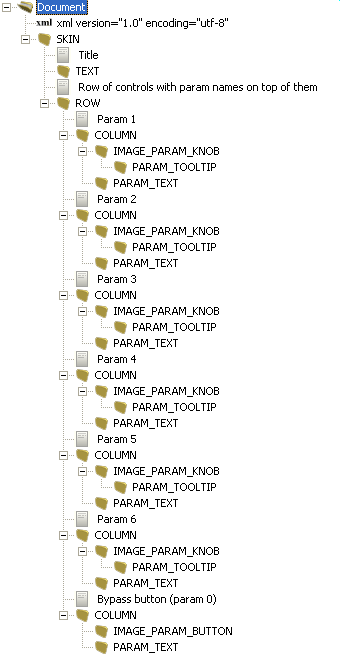
As you can see, the skin is a structured tree of graphical elements (or “cells”). From a structural point of view this skin is a column (layout_type="column") containing:
a text widget aligned to right ('Blue Cat's Chorus')
a row of columns (<COLUMN/>), each one containing
a knob (<IMAGE_PARAM_KNOB/>) or a button (<IMAGE_PARAM_BUTTON/>) to control a parameter (param_id="dsp.input6").
a text widget (<PARAM_TEXT/>) displaying the name (content="{name}") of the parameter (param_id="dsp.input6")
This skin uses the layout capabilities of the skinning language (columns (<COLUMN v_align="top">), rows (<ROW spacing="10">), cells). The layout is computed by the system and the skin designer does not need to specify exact position of the widgets. It is a lot faster and easier to proceed this way. The system also supports pixel-positioning, which can be needed when using a background image for which absolute positions are important. Further more, mixing both positioning system is possible.
As you can see, a skin describes the layout of the GUI in a structured way: widgets or cells contain other widgets or cells, and they can be either positioned (with pixel coordinates) or organized in rows and columns (like in this example).
For any element of the skin, attributes can set, which can modify the appearance, layout or behavior of the element. For example cursor="system::hand" means that the mouse cursor will change to a hand when the mouse is over the control. v_align="top" modifies the alignment of the element in its parent cell.